Schnelker Commission: Progress
Introduction
The following images will give you an idea of the progress of the painting. I've added detailed notes to explain the process as much as possible. The approach is both traditional and improvisational. The work is primarily direct painting, where the objective is to paint the colors as seen, rather than what is called indirect painting, where the work is built up in layers of glazes and scumbles, and the net effect is somewhat unpredictable. The latter method is associated with a time when painters had fewer pigment choices, and often isolation layers were required to keep pigments from adversely interacting.
Direct painting developed in the early 19th century because of the expansion of the available pigments that artists could add to their palette, as a result of the rapid industrialization of the paint industry. This gave artists a much broader repertoire of colors that could be achieved without resorting to layered effects. At the same time the invention of the nickle or tin tube made the paint more portable. Both of these developments made true plein air painting possible.
I hope that you enjoy this process, and that it helps you appreciate the work more fully. I suppose there is the possibility that, like the magician revealing the method of his trickery, you might say "I wish he didn't show us that." In general I'm all for demystifying the creation of cultural objects, because I don't believe that their magic inheres in their method of construction. It has been my own experience that the more I learn about those historical paintings that I like, the deeper their mystery becomes. How can so much cultural meaning be carried by such apparently simple means?
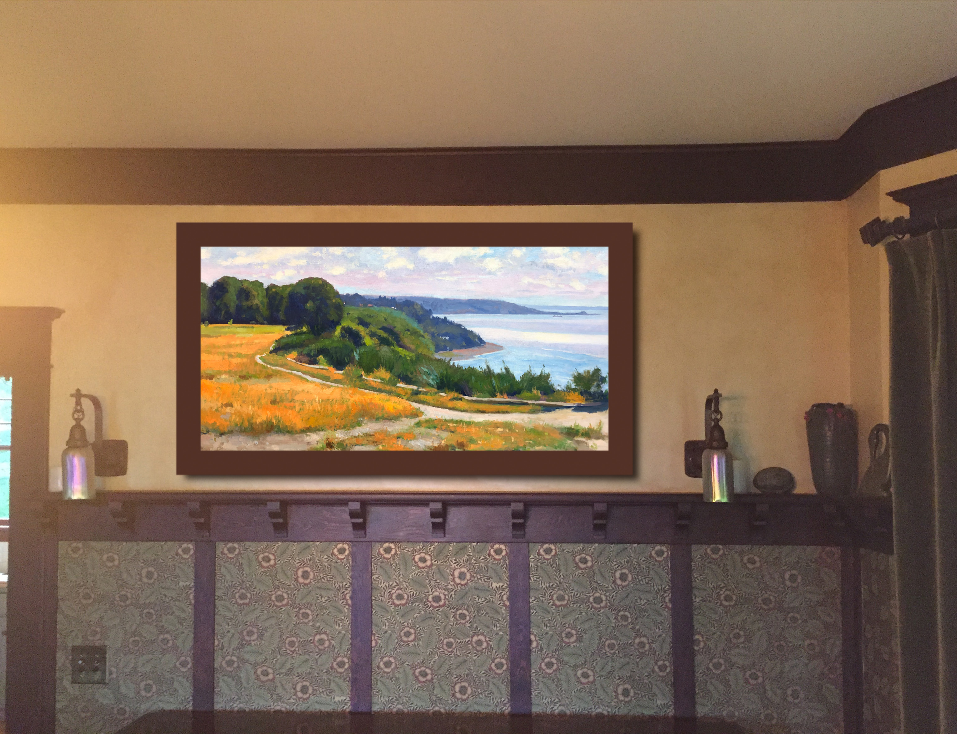
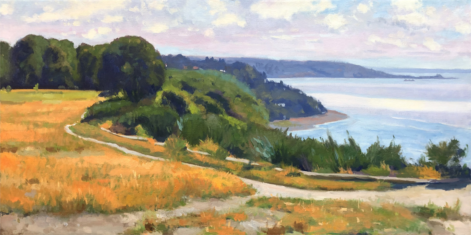
Discovery Park, oil on canvas, 25 x 50 inches, copyright ©2019


The slideshow above will loop automatically, but you can navigate forward and back by hovering over the image and using the navigation arrows that appear.
Notes May 6, 2019
This is a second pass, with modifications to the sky, changes to the foliage on the cliff's edge, the beginnings of articulating the textures and colors of the grass. This latter will be a cumulative effect of interwoven brushstrokes enmeshed over other strokes, and will most likely be the last part of the painting that will be completed. Although the grasses probably will take the longest, they actually only play a supporting role in the composition. The trick is to keep them from upstaging the more important elements.
Toggling between the last three states will give you a better picture of the changes that have been made. You can do this easily by clicking alternately on the last three pagination dots below the slideshow.
I'm in the middle of reworking my concept for the wave-determined color banding on the water, so the current state does not give an accurate picture of where I want to go. The orginal painting had prominent gray-purple banding, but I'd like to push this toward richer blue hues. I also want to introduce some boat traffic, so am reviewing images of boats that I want to try. Probably a steamer or container ship, and maybe a sailboat or two, but in the distance.
I'm aiming for a more complex sky than was depicted in the earlier painting. Something where some clouds exist on a layer in front and are catching light, and other clouds in a 2nd or 3rd layer, in shadow perhaps, possibly with a few random small shadowed clouds in front of the light ones. I did something like this in a painting of Duck Island at Greenlake.
Painting is not a completely predictable process, and I've always found that I do best when I remain open to what the painting wants to say. Sometimes I will try things that don't work, and so they are modified in the next pass. That will certainly be true of this current state.
I have removed a couple of the slides showing the progress of applying gesso, in an effort to make the slideshow a little less cumbersome. I've retained them in the thumbnails below, since they are referenced in the previous notes. I'll continue to reorganize this presentation as the painting evolves, in hopes of making it more navigable.
Notes
These notes describe stages of the painting's development, and are related to specific corresponding images. The numbers can be seen for each image by hovering over the copies of the images below these notes.
The superstructure (image 1) is the frame that the canvas is stretched upon. In this case it is a hybrid aluminum/wood construction with adjustable corners. The adjustable corners are useful if the canvas becomes slack, due to changes in humidity. You can also see cardboard triangles at the corners. These keep the corners squared-up during the stretching process. They are removed once the canvas is fully stretched, as they are no longer necessary.
The cloth that is stretched over this superstructure is called the support (image 2) as it supports the painting. In this case it is a fine medium weight professional artists' linen. It is stretched slightly loose, because when the acrylic gesso ground is applied the linen shrinks. If stretched too tight, it can tear or warp the stretchers.
The ground or foundation (images 2-5), in this case acrylic gesso, is applied from the middle out to the ends in three successive coats. The first coat is sanded, to eliminate the bumps that are the result of the random fuzz on the surface of the raw linen. The next two coats are applied without sanding. The last photograph in this stage was taken after the first coat was applied and before sanding.
The cartoon (image 6) is a map of where the major areas of color will go. In this case it was first sketched in with graphite, then fixed with burnt umber. In Van Eyck's time the cartoon would be quite elaborate, fixed in ink, and the painter would not deviate from it. This was because at that time oil paintings were still underpainted in egg tempera, a medium that does not permit much play. In Titian's time painters began to use the cartoon as merely a starting point, and would freely improvise the composition from a very generalized cartoon. I work in much the same way. Where such deviations from the original drawing occur, the experienced eye can detect them, and understanding these departures is considered an aspect of connoisseurship. They are called pentimenti, Italian for "repentences."
At this stage, or even sometimes before the cartoon stage, a painter may add an imprimatura. This is a general color added to the entire canvas, either in grey, umber or in the case of the Impressionists a "blonde" imprimatura of yellow ochre mixed with white. I prefer to forego this, because I believe that the additional layer of monochrome color compromises the luminosity of the final product. In some respects the imprimatura is subsumed within the lay-in phase of my approach.
The lay-in (images 7-8) serves many different functions. It provides a foil or underpainting for subsequent layers of paint. It also serves as the first impression, an attempt to capture the "big light effect" within which every other aspect of the painting's narrative occurs. For the painter, it pays to dwell in this stage for some time, and not rush to decorate the work with meaningless detail. The painter R. H. Ives Gammell would say "make it like, then make it more like." In some respect, this phase of the lay-in is the real starting point. Another of Gammell's sayings was "the painting doesn't begin until the canvas is covered." What he meant was that it's impossible to accurately judge color and value against the white of the ground. The painter is not interested in color so much as in color relationships, and the stark white of the bare ground compromises that judgment.
Continuing from this point, adjustments (image 8) will be made to almost every aspect of the painting, with modifications of value, color, shape and texture. Michelangelo wrote that "great art consists of thousands of tiny adjustments." Special attention is paid to edges, where one shape or color meets another. Whether the edges are soft or hard affects the way we perceive the focus or depth of field of the painting. The goal in part is to carry the painting to a successful conclusion without sacrificing overall unity. Returning to Gammell's statement, "make it like, then make it more like," this can be interpreted in many different ways. One begins with large, generalized shapes, then refines them over time. The same is true of color, where a general patch of color gives way to subtle variations. Simple, telling details have more weight than an exhaustive inventory of them.
Some Additional Thoughts
The painting as pictured here is at an early stage. I've chosen to do a variation of my earlier work of the same subject, but with a different compositional emphasis. I've eliminated much of the sand pit that occupies the foreground of the older painting. I've stuck to the same season, as that provides some of the most pleasing color harmonies, the rich yellow-oranges, the greens and the purple-blues of the sky and water.
Interestingly, the view that was available when I did the earlier painting is not really the same now. The sand pit, where I stood for the previous painting, has lost some considerable height, either from the elements or from intentional human modification. One cannot get the same view over the bluff, and much of the shrubbery and tundra that edges the pathway is much higher. There has been an addition of an unattractive informational sign that wasn't there before. For that reason I've chosen to stick with the older view, using the earlier painting and its source material to develop this image.
Materials
Superstructure: Wood, aluminum, wood braces with plastic composite connectors, adjustible corner brackets.
Support: Belgian linen
Ground: Acrylic gesso
Pigments: Titanium white, cadmium lemon, cadmium yellow medium, yellow ochre, cadmium orange, cadmium red medium, venetian red, burnt sienna, burnt umber, alizarin permanent, viridian, cerulean blue, ultramarine blue.
Binder: Liquin alkyd resin


William E. Elston
aritst/owner: w. e. elston fine arts

SHARE THIS PAGE
